Kate has published a gardening column for a number of years, and had a large collection of photos from this period. Having a lot of writing and photos gave a lot of scope for making a very immediately visual website.
Kate does one big post per month that gets published in the local newsletter, but wanted the option to do extra, smaller posts during the month. We therefore designed a subtle sort mode that publishes each month in descending order, with the month's main post first. This means that new visitors always see the latest column first.
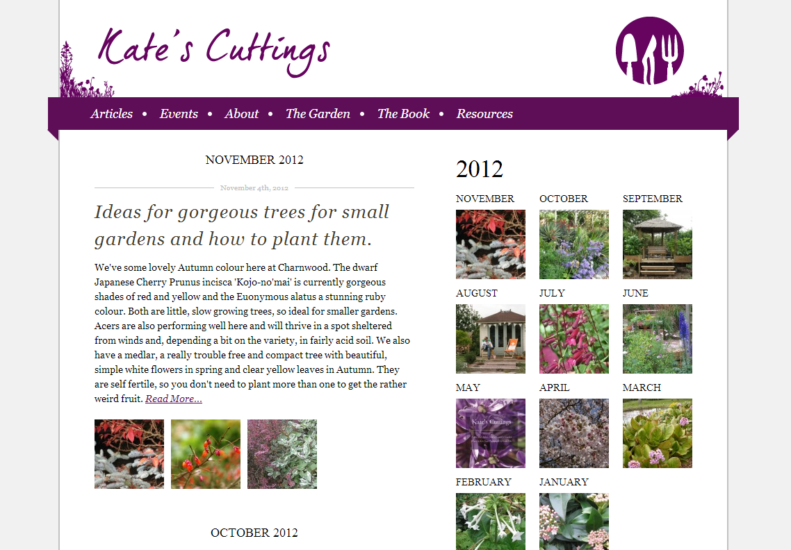
The defining feature of this site is the right sidebar. Given the subject matter (gardening), it seemed important to emphasise the passing of the seasons, so we used the first thumbnail from each month's main entry to create the month-view links on the right. The flow of this is a central design element, and I think a huge improvement on a default "month by month" archive box.
Responsive layouts were then added using Omega breakpoints.
- When: Spring 2012
- Tech: Drupal 7, Omega Subtheme, extensive Views and Media module use.
- Team: Kim Foale (development), Roshana Rubin-Mayhew (design)
- Site: http://katescuttings.net