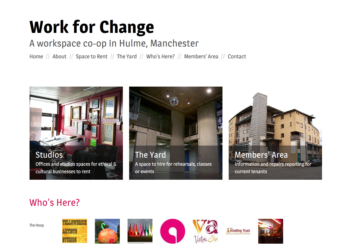
Work For Change is a co-op office complex. They had an existing website that wasn’t getting them any Google hits for local keywords (the name of the theater, the workspace itself), and sprawled over about 20 pages even though there was very little information.

They wanted something low-budget, clean and functional. Working with them, we established the key user stories and developed a new site around them:
- “I am a small business or individual looking to find a studio for rent”
- “I rent an office and wish to report a repair”
- “I wish to hire the theatre”
These were then simply translated into the three boxes on the front page, linking to a relevant page for that user group. We condensed all the existing site content under each section, in most cases getting all the information on a single page. A very simple responsive layout was made, generally aimed at the large amount of smartphone users in the workplace.